UniBuy
Building a Trusted Circular Economy for Campus Life
Reducing waste and financial strain by providing students a verified, peer-to-peer marketplace designed for the unique lifecycle of university living.
Timeline
3 months
Worked as
Researcher
UI/UX Designer
Graphic Designer
Tools
Figma
Illustrator
Google Docs

The Problem
😵💫
Friction
Existing marketplaces (Facebook, eBay) are riddled with 'Stranger Danger', logistical hurdles, and myriad of products. For students moving annually, the friction of buying and selling furniture or textbooks often leads to high-value items ending up in landfills.
😎
Fix
UniBuy creates a 'Closed-Loop' ecosystem. By requiring university verification, we eliminate the trust gap, allowing students to buy, sell, and trade within a secure community, effectively turning campus waste into student savings.
Getting started
I conducted a competitive audit of established platforms like Amazon, eBay, and Olio Marketplace to identify where they fail the specific needs of a university campus. This research highlighted a gap in localised, student-centric marketplace that the needs of university move-in/move-out process.


pic. competitive audit of the competition.
Through interviews with university students, I mapped the needs and affordability of students looking for convenience. These insights directly shaped the User Personas ensuring the app addressed the real-world logistical hurdles students face during the academic living period.


pic. user personas.
This led to a series of Paper Wireframes, allowing for rapid iteration of the marketplace layout and navigation.
Sketching by hand enabled me to test the features and flows quickly, ensuring that the interface remained intuitive before moving into high-fidelity production.


pic. paper wireframes with annotations.
Key Ideas
1
The Forum: Solving One-Time Needs
A key outcome of the research was the need for a Forum Page. This allows users to request items for one-time use or specific use-cases—solving the problem of students having to buy expensive equipment they only need temporarily.
2
The Request Page: Community-Driven Supply
To ensure the marketplace remains useful even when items aren't listed, I implemented a Request Page. This empowers the community to communicate their specific needs, making it easier for sellers to meet the actual demand on campus.
Defining the Looks
The UniBuy identity was developed to balance campus energy with transactional security. I moved from initial logo sketches to digital iterations, focusing on a mark that remains legible at small scales.


pic. initial logo explorations on paper and digital iterations.
I chose Space Grotesk, a clean, modern sans-serif typeface to prioritise legibility. The typographic hierarchy was engineered to help users quickly scan item prices, titles, and key information, reducing the time spent processing information and increasing the speed of the transaction.
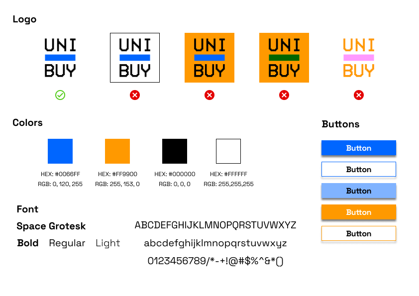
pic. A brief brand guidelines.
Building the bones
Before building screens, I mapped the end-to-end User Flow to visualise the path from item discovery to final transaction. This allowed me to audit the logic of the features, ensuring that the navigation stayed flat and the user never felt "lost" within the marketplace hierarchy.

pic. user flow.
Transitioning to digital lo-fi wireframes allowed for early-stage user testing. This phase was critical in identifying friction points in the checkout and listing loops, specifically where users needed more clarity on item condition and seller information.
By focusing on the "Bones" of the interface, I was able to simplify the navigation bar and navigation button placements, ensuring that the primary actions were always within reach.


pic. low fidelity design changes.

pic. screenshot of lo-fi prototype, click on the image to view the prototype.
Final Execution
For UniBuy, I moved away from the sleek, generic look of modern fintech and opted for a Retro-Minimalist aesthetic. This theme was a deliberate nod to the origins of early university computing and bulletin-board systems. By stripping the interface down to its bare essentials, the design fosters a sense of raw, community-driven authenticity—recapturing the "close-knit" feel of campus life.
Reflections
1

Identifying the "Trust Gap" in Niche Markets
This project proved that even in a saturated marketplace economy, there are significant gaps where generic solutions fail. By focusing on the unique, high-friction lifecycle of a university student (the move-in/move-out rush), I learned that hyper-localisation is a powerful differentiator. UniBuy isn't just a shop; it’s a verified safety net for a specific community.
2

Research-Based Feature Prioritisation
My research and the development of personas didn’t just sit in a folder, they directly dictated the UI. Features like the Forum and Request Hub were born from identifying real student frustrations, ensuring that everything on the screen had a functional reason for existing.
3

The Discipline of Iteration
UniBuy taught me that a "polished" design is never the first design. The iterative path, from messy paper sketches to the finalised retro-minimalist UI, reinforced the value of early failure. By identifying UX bottlenecks during the lo-fi testing phase, I was able to refine the navigation and visual hierarchy, ensuring a final product that is as intuitive as it is aesthetic.