AnnoNote

Skills
Research
Analysis
Wireframing
Design Thinking
Brainstorming
Prototyping
Dark Mode
Visual language
Critical Thinking
Overview
As part of my master's course, I developed AnnoNote, a digital annotation and note-taking app tailored for avid readers. The app aims to provide a seamless way for users to organise and access their notes and thoughts on books in a single, secure platform. The project involved extensive research and design processes, culminating in a high-fidelity prototype.
Master's Project, University of Winchester
How the idea came about?
During the second semester of my Master's program, I conducted an in-depth research project on the increasing adoption of 'Dark Mode' in UI/UX design.
This research served as the foundational platform for my final application design project. Motivated by the insights gained, I aimed to develop an application that effectively leveraged the benefits of dark mode.
Through extensive brainstorming and market analysis, I identified a need for a mobile note-taking app designed for annotating while reading books.

Guiding framework
For this project, I explored various design frameworks, ultimately choosing the Double Diamond model and Design Thinking methodology. These models were selected for their emphasis on continuous user feedback and iterative design.
The Double Diamond model was particularly useful during the research and ideation phases, providing constant feedback loops. Design Thinking offered a flexible, non-linear approach, which was crucial given the project's timeframe and multiple focus areas. While these frameworks guided the process, I adapted them as needed to achieve the best design outcomes


Research
As part of research for building on my app design, four note-taking apps were looked at. Microsoft OneNote, Apple Notes, Everynote and Bear were the chosen apps. All four applications’ features, user interface, unique proposition and use case scenarios were explored.
Various forums, such as Reddit were also explored to understand the need of digital note taking app. The information was also used to guide the design from the initial stage.


Competitve analysis was done to extract useful information from the four apps. The user interface of each app was given close attention as all four apps had very different interfaces.


Takeaways
_
Minimal UI Design
Adopt a clean and streamlined user interface, similar to Apple Notes, to ensure a user-friendly experience that focuses on essential functions.
_
Effective Search
Implement a fast and accurate search feature, to help users quickly find relevant information.
_
Flexible Linking
Incorporate flexible note organization using linking and nesting features, to allow users to connect thoughts and organize notes efficiently.
To give a clear direction to the project various tools such as user personas, HMW, problem statements, user journey map and information architure were created.
Initial Design Stage

Created a map to pour out all the feautres ideally the app should have.


Problem statement & HMW for clearer guide for the project.


User personas were generated based on the various target audience.

User journey map comparing the emotions with and without the app.


Possible user actions were thought of.
App information architure draft was created.
Lo-fi wireframing
Paper wireframing provided a tactile, visual approach to iterate on the note-taking app’s information architecture and screen layouts.
Drafting the app’s structure and key screens with paper and pen, enabled rapid ideation unconstrained by software tools. Sketching wireframes focused attention early on crucial UX considerations like navigation hierarchy, placement of primary functions, and minimising cognitive load.

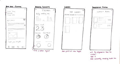

Feedback from friends revealed opportunities to refine the flow and interaction design, as this was the first time the app took a physical form, which people could see and provide comments on. Visually mapping out the structure of the app fostered a deeper understanding of how to translate key user goals into the application’s interface and features.


Working in the digital medium introduced new constraints not present on paper, forcing critical re-evaluation of initial concepts. Screen sizes, button placement, and navigational patterns had to be adjusted for mobile devices. Complex features imagined early on proved difficult to implement digitally in an intuitive way.


Click on the image to view the lo-fi prototype.
Creating the Final look

The culminating stage of the design process involved generating a high-fidelity design, visual assets and an interactive, clickable prototype to represent the finalised vision for the note-taking app.


Click to view the light theme prototype.

Click to view the dark theme prototype.
What did I Learn?
Unique Needs
1.
Despite the prevalence of note-taking apps, the unique needs of readers who wish to annotate and organise their thoughts on books are not fully met by existing solutions. This project highlighted the importance of addressing these specific requirements to create a valuable tool for avid readers.
Dark Mode
2.
One of the key learnings was the effective implementation of dark mode. The project provided practical experience in designing and testing dark mode interfaces, highlighting both the benefits and challenges of this popular UI trend.
Iterative Process
3.
The iterative nature of the design process was crucial in refining AnnoNote. Each stage, from wireframing to prototyping and user testing, provided valuable insights that informed subsequent design decisions. This approach ensured a polished final product that met user expectations.